Saturday, 28 January 2012
Friday, 27 January 2012
Tuesday, 24 January 2012
Main Image
This is the picture I have chosen to use for the main image. I have chosen this image because the model is smiling which presents a good vibe and also he is wearing headphones which portrays music is involved.
I then changed the brightness and contrast so the picture isnt dull before cropping it for the front cover.
I then changed the brightness and contrast so the picture isnt dull before cropping it for the front cover.
Content layout research
I was looking at the contents page of 'KERRANG' and noticed a couple of features I liked about the layout. The 1st thing is that the title on the page 'Contents' is in the top right corner of the page. This leaves more space for the text underneath rather than it being in the middle.
Another thing is noticed is that the contents page is split into three columns. The biggest column on the left because it contains a big image and two narrower colmns on the right of the page. This gives more organisation to the page and could make it easier to plan.
Alternatively, I also looked at a content page from both 'XXL Magazine' and 'Vibe Magazine'. Although these two content pages have a very strong image which is suitable to attract my target audience, there is hardly any text on the content page which leaves a large amount of space. Just like the 'KERRANG' content page, the 'Vibe Magazine' content page also says 'content' on the top right hand side of the page so I will carry this across onto my product.
Tuesday, 17 January 2012
Front page & Content so far
This is a screen grab of my music magazine front cover and content page so far. It is obviously unfinished and alot of work is still to be done but the class did a peer assesment activity where we all moved around and wrote comments on what we like and dislike about each others magazine front page and content page.
Three people looked at my work and this is what they said.
Person1 said, 'The title stands out very well and merges in with the background, however when adding your image you may have to shorten the length of effects. I think the font may be too big, I think it would be better for you to reduce the text and add more cover lines. I like the bottom half of your magazine, it sticks well with the color scheme. Your content page is not finished.'
Person2 said, 'I like the font and gradient background, and main coverline works well. I dont agree with the 'Cont Ent' on the contents page, try it on one page.
Person3 said, 'Font works well with title. 'Realist' is very effective. Obvious lack of picture. Lots of space above 'Money'. Contents unclear as to what is what. Good colour scheme.
I have taken all this feed back into consideration and will take the advice when editing and improving the magazine front cover and contents page.
Friday, 6 January 2012
Front Cover Construction
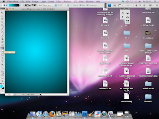
To start off my magazine cover I used the gradient tool to color in the white background. I chose to make it move from blue to black because I did not want it to look too dark or too bright. Also the blue color has a cool tone which is what R&B artists and rappers portray.
Next I added the Magazine title 'MIXTAPE'. I chose this name because it is associated with rap; complements R&B artists such as 50 Cent, Drake, Lil Wayne and would appeal to the target audience. I also made the text color white so it would stand out from the background.
The title needed to stand out more so I copied the layer and rotated it 90 degrees four times and each time using a wind effect. I then made it red and moved the copy behind the original layer. This made the title stand out more and also gave it a sound wave effect.
I have decided to change the color of the background to suit the title more and also the gradient style has been changed. I have also added the name of my artist 'TAZ' featuring in my front cover and a quote from the song 'I'm on one'. This will help to attract the target audience because they will be familiar with the lyrics of the song. I have chosen White, Red and Light Blue as the colors for the house style of 'MIXTAPE' music magazine.
I have decided to change the color of the background to suit the title more and also the gradient style has been changed. I have also added the name of my artist 'TAZ' featuring in my front cover and a quote from the song 'I'm on one'. This will help to attract the target audience because they will be familiar with the lyrics of the song. I have chosen White, Red and Light Blue as the colors for the house style of 'MIXTAPE' music magazine.
First attempt for front cover images
These are screen grabs of the first 58 pictures I took for the main image of my magazine cover. These pictures cannot be used because unlike the examples of most magazine covers I have seen, these pictures are not taken at close up range. They are too far so non of them can be used for my front cover.
Subscribe to:
Comments (Atom)


