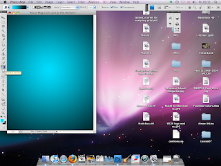
To start off my magazine cover I used the gradient tool to color in the white background. I chose to make it move from blue to black because I did not want it to look too dark or too bright. Also the blue color has a cool tone which is what R&B artists and rappers portray.
Next I added the Magazine title 'MIXTAPE'. I chose this name because it is associated with rap; complements R&B artists such as 50 Cent, Drake, Lil Wayne and would appeal to the target audience. I also made the text color white so it would stand out from the background.
The title needed to stand out more so I copied the layer and rotated it 90 degrees four times and each time using a wind effect. I then made it red and moved the copy behind the original layer. This made the title stand out more and also gave it a sound wave effect.
I have decided to change the color of the background to suit the title more and also the gradient style has been changed. I have also added the name of my artist 'TAZ' featuring in my front cover and a quote from the song 'I'm on one'. This will help to attract the target audience because they will be familiar with the lyrics of the song. I have chosen White, Red and Light Blue as the colors for the house style of 'MIXTAPE' music magazine.
I have decided to change the color of the background to suit the title more and also the gradient style has been changed. I have also added the name of my artist 'TAZ' featuring in my front cover and a quote from the song 'I'm on one'. This will help to attract the target audience because they will be familiar with the lyrics of the song. I have chosen White, Red and Light Blue as the colors for the house style of 'MIXTAPE' music magazine.


No comments:
Post a Comment